Eureka Noiseless Talking Machine Lubricant

I think this vintage tin I spotted this weekend is completely $8 worth of fun — even if you’re not a record collector!

Manufactured by Ilsley-Doubleday & Co. of New York, this is “the perfect lubricant for all makes and styles of phonographs and talking machines.”

See also this Zeen with a collection of some of the articles on records, record collecting, and turntables that my husband and I have written.

Meet Bruce & Beth

A pair of vintage pottery figurines — Asian dancers of some sort.

As you can see, from the markings on the bottoms of the pieces, his name is “Bruce” and her’s is “Beth”.

Both Bruce & Beth were made by The Ceramic Arts Studio in Madison, Wisconsin. These are but two of the more than 800 figurines Betty Harrington designed in her 14 years at the company. Likely made sometime in the late 1940s or in the 1950s, the pair of figurines are specific examples of the Harrington’s work and noted in Ceramic Arts Studio: The Legacy of Betty Harrington along with the following information:

Betty’s interest in the costume designs of modern dance pioneer Martha Graham led to a series of arts-inspired draped figures, with arms and legs fully, or partially, concealed under flowing garments. This simple and modern styling elevated CAS design to a new level. Not only did the body draping result in what Betty called “beautiful, graceful forms”, it also had a more practical result: exquisite detail was realized with a minimum of time and labor.

I probably sold them too cheaply… But that just means they delighted someone and got to be taken home and displayed far faster. *wink*

A Back To School Primer On Collecting Vintage Dick & Jane Books

Dick and Jane books are among the most popularly collected school books. This is because the series of books was used for over 40 years in American schools. That’s millions of children who were taught by Dick, Jane, Sally, Pam, Penny, Mike, their neighbors, families, and pets! Here’s a bit of history on the vintage Dick and Jane series of books.

In the late 1920s, Zerna Addis Sharp sought out William S. Gray, a renowned educational psychologist and reading authority from the University of Chicago, and pitched to him her philosophy that children are more receptive to reading if the books contained illustrations related to them and their lives. Gray was impressed enough to hire Sharp. While illustrations of the family Sharp created were published in earlier versions of primers by Scott, Foresman and Company, it wasn’t until later that Dick and Jane would appear by name.

In 1930, Gray and William H. Elson, along with May Hill Arbuthnot, created the Curriculum Foundation Series of books for Scott, Foresman and Company.  Here Dick & Jane and their family appeared in the first edition of the Curriculum Foundation Series pre-primer called Elson Basic Readers. In this edition, the baby sister was not named yet (she was simply called “Baby”), the cat was called “Little Mew”, and Spot, the dog, was a terrier.

In 1934, the pre-primer was renamed Dick and Jane and a second book, also a pre-primer, More Dick and Jane Stories, was added. In 1936, the series title changed to Elson-Gray Basic Readers to acknowledge Gray’s role in the series (Sharp was not acknowledged, despite what would be a 30 year career at Scott, Foresman & Company). Eleanor Campbell and Keith Ward did the illustrations, and Marion Monroe also authored some of these early editions of the Dick and Jane books.

Scott, Foresman and Co. retired the Elson-Gray series in 1940, but Dick and Jane remained in the Basic Readers and their Think-and-Do workbooks. Now the baby sister is named Sally — and she gets a teddy bear named Tim, the cat becomes Puff, and Spot becomes a Cocker Spaniel. New books in the series were introduced in 1940 and 1946. In Canada, English and French versions of the Dick and Jane books were translated and published by W.J. Gage & Co., Limited; and British English versions were published by Wheaton in Exidir in the UK. Official Catholic editions of the series, the Cathedral Basic Readers, were created to teach religious themes along with reading. For example, Sally, Dick, and Jane was retitled Judy, John, and Jean to reflect Catholic Saints and to include stories on morality. In the 1946 edition, Tim the teddy was removed and a toy duck was added. Also, Texas had its own editions of the the books in 1946. Another author, A. Sterl Artley, began writing Dick and Jane books in 1947. By the end of the 1940s, the Collection Cathedral was published for French-Canadian Catholics.

By the 1950’s, over 80% of first-graders in the United States were learning to read with Dick and Jane. New editions whose titles began with “The New” were added, and Robert Childress would become the illustrator. But it was during this decade that Dick and Jane et al. would find themselves under strong attack. Concerned groups criticized everything from misrepresentations of perfection and other cultural issues to matters of literacy itself. In 1955’s Why Johnny Can’t Read, Rudolf Flesch blamed the look-say style of Dick and Jane readers for not properly teaching children how to read or appreciate literature. While phonetics were always a part of the Dick and Jane series, there was not enough for the growing movement of phonics fans. For all of these reasons, most of the major changes to the Dick and Jane series occurred in the 1960s.

In 1962, Helen M. Robinson was the new head author, the books had new material (including more phonics), new illustrations by Richard Wiley, and Dick and Jane had matured, in age and sophisticated. The initial printings of the 1962 soft-cover Dick and Jane books increased in page size and did not have the white tape reinforcement on the spine. The covers of these editions fell off rather easily — which is why they are so hard to find with covers intact.  As a result, Scott, Foresman and Company added the reinforced taped spines and advertised the feature heavily. (These books were never issued as hardcovers; any hardcover copies were either library bindings or were rebound later.)

But in 1965, both Civil Rights school integration and President Lyndon B. Johnson’s Elementary and Secondary Education Act would continue to challenge the book publisher.

Scott, Foresman and Company worked to address the school integration and inclusion issues by once again employing Zerna Sharp’s literacy philosophy. The African-American family, including twins Pam and Penny and their brother Mike, first appeared in the 1964 Catholic School books; public school students were introduced to the African-American family in 1965. (In response to outrage from racist complaints, Scott, Foresman & Company offered alternative covers of the 1965 integrated books; these Child Art editions removed the characters from the covers and replaced them with finger-paint art designs. Later editions of Think and Do books just had solid color blocks.) Also in 1965, the Pacific Press Publishing Association published an integrated version of Fun With Dick and Jane for Seventh-day Adventists. Entitled Friends We Know, Jesus appears on the covers along with Dick, Jane and Mike.

In the mid 1960s, Scott, Foresman and Company tried to address the phonics issue by introducing books in an experimental language called Initial Teaching Alphabet or ITA. The Experimental Edition of the Scott-Foresman pre-primer was titled Nou Wee Reed. These ITA Dick and Jane books are rare finds.

In the late 1960s, the Dick and Jane books expanded to include three new series based on academic performance. For those performing below grade level, there was Open Highways. (Original printings of these books had “The Open Highways Readers” printed on the spine; later printings just had “Open Highways”.) For strong readers, Scott, Foresman and Company added Wide Horizons, self-directed readers which did not have workbooks, and for even more advanced or gifted readers, there was also Bright Horizons. Reading Inventory tests were added to the Dick and Jane series to use as a placement guide.

Despite all Scott, Foresman and Co. tried to do, the book publisher just couldn’t overcome all the objections, especially those regarding the too-perfect Dick and Jane world. The goody-goody kids and their ideal gender stereotyped simplicity was no longer relatable or desirable.  The series was officially ended in the late 1960s, replaced in 1970 with Scott, Foresman Reading Systems. (However, in 1975, the 1962 pre-primer was republished by the American Printing House for the Blind in a large type edition with black and white images for sight-impaired children.) Still, Dick and Jane books continued to be ordered and sold from warehouse stock well into the 1970s.

The books Dick and Jane collectors are searching for today are those which managed to be saved — and held onto — by teachers, staff, and students, despite the fact that many schools were even ordered to destroy all remaining copies of works in the series. For these reasons, along with the usual wear and tear of children’s books, finding vintage Dick and Jane books in pristine conditions is very difficult. Collectors learn to live with writings, doodles and marks, missing pages, etc. — or pay steep prices for not having signs of use.

Over the decades, many Dick and Jane materials were produced. Along with the readers and primers mentioned, there were other subject books, such as art, health, math, etc. There were teacher editions; books on teaching techniques; large display books placed on easels, called Our Big Book; posters and picture cut-outs for classroom display; picture and word flash cards; LP record albums; games for the classroom; and other teaching aids.

On the business end, Scott, Foresman and Co. sent out catalogs, newsletters, and promotional items, such as calendars, greeting cards, and Christmas ornaments. These items were produced in much smaller quantities and, being ephemeral in nature, are rare finds.

But Dick and Jane live on.

In 1977, George Segal and Jane Fonda would star in Fun with Dick and Jane, a film based on a Gerald Gaiser story about the failed promises of a Dick and Jane perfect world. (The film was remade with Jim Carrey and Tea Leoni in 2005.)

In 2003, Grosset & Dunlap rereleased original Dick and Jane primers, selling over 2.5 million copies in just over a year even with a publisher disclaimer that the books were nostalgic and not to be used to teach children to read. Due to the popularity of the reissue, reproductions and new related merchandise featuring the iconic imagery and catch phrases, like “See Spot run!”, has been produced.

Additional Resources:

A rather complete list of original Dick and Jane books is here.

Carole Kismaric’s Growing Up with Dick and Jane: Learning and Living the American Dream captures the nostalgia while tracing the cultural points of the Dick and Jane series.

Image Credits:
(In order they appear)

Our Big Book, Dick and Jane Teacher’s Classroom Edition, via into_vintage.

First Dick and Jane book, the 1930 Elson Basic reader, via Tiny Town Books & Toys.

Set of 11 vintage Dick and Jane readers from the 1940s and set of 13 readers from the 1950s, via Wahoos House.

The 1963 Judy, John And Jean New Cathedral Basic Reader, via Keller Books.

Set of 13 books from 1960s, via Wahoos House.

A set of 1930s Dick and Jane flashcards, via Wahoos House; vintage Dick and Jane Blackout Game, circa 1950s, and 1951 Poetry Time three-record Dick and Jane set, narrated in the voice of May Hill Arbuthnot one of the original Dick and Jane authors, via Tiny Town Books & Toys.

The 1954 Scott, Foresman and Company Dick and Jane sales catalog, via Tiny Town Books & Toys.

This One Was Hard To Part With

Sold this lovely turquoise vintage Dormeyer mixer at the yard sale. I really wanted to keep it, but as I’ve said, “I only keep a dozen mixers a time. When I reach more than 13—a baker’s dozen—I have to sell some off, because what good are they in boxes in the basement? Well, OK, 10 in the basement is fine. But 12? That’s insane… Right?

Vintage Illustrated Lingerie Boxes

Just a few examples of vintage lingerie packaging with great graphics seen recently on eBay. Lingerie blogger, A Slip Of A Girl, has written a post about why she collects vintage lingerie illustrations.

Image Credits:

Vintage Glamorise bra box via 54closet.

Vintage Jantzen girdle box via klamms3.

Vintage Cleopatra Goddess long-line bra via crazygregs.

The Early Gay Fad Years Provide Clues For Glassware Collectors

Always wanting to learn more, I contacted Kitty Hanson of the Santa Fe Trading Post about my suspected Gay Fad juice set.

Miss Kitty, as she is most known, is co-author of the new and incredibly, exhaustively, researched two-volume encyclopedia set about Fran Taylor and Gay Fad Studios, Gay Fad: Fran Taylor’s Extraordinary Legacy. She was gracious enough to write back with a great deal of information:

Hi Deanna,

I went to your site and enjoyed the article and photo of your Anchor Hocking juice set with the hand-painted oranges. My opinion is that you may well have an early Gay Fad orange design, but that’s going to be difficult to definitively prove. However, I can add a few more clues.

We know for sure that Fran often painted her GF designs on Anchor Hocking blanks, and I, too, have found what seems to be authoritative information that AH’s Manhattan pattern was produced from 1938-1943. So if your set is by Gay Fad, that would mean that Fran produced it in Detroit before moving Gay Fad Studios to Lancaster, OH in 1945. As we say in “The Fran Taylor Story” chapter of our book (page 5, volume 1), we have yet to discover a newspaper article about Fran or Gay Fad or a Gay Fad ad dated prior to 1945. But we do know that all of her Detroit work was done with “cold painting” because she didn’t have the ceramic paints or equipment necessary to do fired designs until moving to Lancaster and installing a lehr in her new production facility. Obviously your set is “cold painted” and that accounts for the flaking paint on your juice set.

Interestingly enough, Red Burn (Fran’s first husband and GF vice president) wrote an article for the July, 1949 issue of Crockery and Glass Journal where he explained the difference between cold painting and fired painting and the fact that cold painting has durability issues. That article is reproduced in the “Gay Fad Articles” chapter (page 180, Volume 2).

We also know that Gay Fad produced a variety of Orange designs over the years, and we show pictures of 10 of them in the “Gay Fad Designs – Identified” chapter (page 103 of Volume 1). Our earliest example is from a GF ad in the February, 1947 edition of Crockery & Glass Journal.

Your design is different from any of the ones we show, but again, we have only three pre-1945 examples of Fran’s work: a Rose design lamp she gave to her brother as a wedding present in 1941 (page 4, volume 1), a Fruit design recipe box she gave to his wife during the early 40’s (page 5, volume 1), and one of the wastebaskets that “started it all” (page 3, volume 1) cut from a photo in the “Beauty and the Baskets” article in the June, 1947 edition of American Magazine (full article on page 169, volume 2).

Another reason why I think your orange design is probably an early GF piece is because of the squiggly stem on the bottom of the orange on your carafe. The fruits (apple, pear, grapes) on Fran’s early 40’s recipe box clearly have squiggly stems, as do many of GF’s various fruit designs, including some of the various Orange designs.

In addition, several of the GF Orange designs are painted in orange and yellow similar to yours. Donna has a similarly-shaped carafe/pitcher (NOT the ribbed Manhattan pattern) with a double orange design in orange and yellow, plus a squiggly bottom stem (page 103, volume 1), all of which looks very much like your single orange.

So again, my opinion is that your set may well be an early Gay Fad orange design, but that’s going to be almost impossible to prove – at least at this point in time.

Hope this helps!

Best wishes,
Miss Kitty

This information is exciting!

I was pretty sure the vintage glass was cold-painted, but honestly, the texture and flakes had me confused… All the cold-paint pieces I have are vintage ceramic pieces, and there the paint appears more “slipped off” and not something that you can feel like you can on this set. (But then again, who knows how it was taken care of? An idiot putting the vintage glassware in a dishwasher back in the 1980s?! I’ve seen damages from dumber things.) I didn’t think the art glass was decorated with decals; there’s no film or lines surrounding the fruits and leaves; and you can see paint strokes and layers, especially behind the clear glass. But there are transfer processes too…  Glassware can be so confusing!

But Miss Kitty’s information makes sense.  The dates of the vintage Depression glass coincide with Fran Taylor and Gay Fad’s early years during which the cold painting was done. Likely there was some experimentation with different paints and processes. Conditions, like on this set, will be an issue. But I’m rather charmed by signs of use and the notion of a woman starting her business.

I don’t really collect glass. Partly because of the confusion about the different process involved; partly because glassware doesn’t speak to me. However, there’s something about Gay Fad Studio’s designs, and, especially, Fran Taylor herself that speaks to me… I do also have a ballerina shaker that I’ve since come to believe was a Gay Fad Studios piece too. So maybe I’ll have to pluck this vintage juice set out of the case and just accept the fact that I’m now collecting Gay Fad glassware. I don’t think I’ll be able to stop myself from looking for her early pieces anyway. *wink*

Now, about the Gay Fad books by Miss Kitty and Gay Fad collector Donna McGrady…

I want them in the worst way. The price of the two-volume set (a total of 610 pages, 1,549 photographs, and 745 scans) is $149.95 (buying both together saves you 25% off list price and gets you free priority shipping to anywhere in the USA). That’s pricey; but this information isn’t anywhere else (she softly whined). So it’s on my wishlist. If you care to gift me the books, or donate towards them, just let me know. *wink*

What Is Mid-Century Modern?

If you’ve spent any time talking with other collectors, antiquers, dealers, or folks who just enjoy watching the plethora of collecting shows, you’ve been hearing an increase in the term “mid-century modern.” Loosely applied, the term can mean anything made in the middle of the last, or 20th, century, usually 1940-1960. But more aptly, the term applies to a design aesthetic which embraces the marriage between function and form — with a simplicity of style born of the artistic and cultural movement of Modernism. And because of the “modern” in “mid-century modern”, the style dates back much further than the name implies.

Modernism is more than just an artistic style; it’s a cultural movement. The movement’s origins go far back as the 1880s, to Germany before the first World War. Despite, or perhaps because of, the prevailing conservatism, there was an increased interest in what the Germans considered the very American notion of usefulness — or, as Dennis Crockett phrased it in his book, German Post-Expressionism: The Art of the Great Disorder 1918-1924, the “predilection for functional work.”

This philosophy, called Neues Bauen or New Objectivity, was first or most notably employed in addressing the German housing crisis of the time. The physical design application of New Objectivity resulted in design innovations in architecture, in which the commercial need for cost-effective housing was met with a radically simplified yet dynamic functionalism, offering simplicity, health, and beauty for the occupants. This solidified the notion that mass-production was indeed reconcilable with individual artistic spirit — it meant affordability — and it was something the famous Bauhaus would build upon when it was founded by Walter Gropius in 1919.

Widely acknowledged as the the first academy for design in the world, the Bauhaus manifesto includes the declaration “to create a new unity of crafts, art and technology.” It was here students and artists would focus on the craftsmanship and the manufacture of works in a collaborative setting, “to produce a work that is not limited to its purely aesthetic meaning, but supports and even influences the transformation of social reality and thus shapes a new society.” And at this time, the transformation desired was a modern one of simplicity and functionality. (For more on the Bauhaus movement and the artists themselves, I highly recommend a book I’ve been reading The Bauhaus Group: Six Masters of Modernism, by Nicholas Fox Weber. It’s fascinating!) Here is where mid-century modern truly begins.

Because the Bauhaus produced more than a mere decorative style, because it pushed the values and needs of a modern world, the school, the artists, and the works created would inspire many others throughout the (mainly Western) world. Spurred on by urban living and the rapid development of plastics and other materials, mid-century modernism became quite popular.

Some of the most known — and collected names — in what we now call mid-century modern, were influenced by the Bauhaus and the movement. They include Americans Ray and Charles Eames (who made fabulous toys too!); Brits Robin Day and his wife Lucienne, and Ernest Race; the Japanese designer and sculptor Isamu Noguchi; and Scandinavians Børge Mogensen, Arne Jacobsen, Finn Juhl (PDF), and Hans Wegner. (Because of the latter design giants, mid-century modern overlaps with, and is often confused for, Scandinavian or Danish design. Here the date of creation and manufacture help make the final decision.)

Here’s a photo of mid-century modern designers George Nelson, Edward Wormley, Eero Saainen (who died not long after this photo was taken), Harry Bertoia, Charles Eames, and Jens Risom for an article in Playboy, July 1961.

Furniture wasn’t the only thing affected by mid-century modernist design. Other functional household objects, such as clocks, radios, and lamps (this was the start of lava lamps!) were made — and are heavily collected today.

Housewares, kitchenalia, and decorative items also got the mid-century modern treatment. You’ll see lots of geometric yet sleek pottery and glassware with embossed patterns and lines of the mid-century mod design. While there still were the more traditional shapes and forms, some with more elaborate and fancy painted designs, made during this time too (Hey, not everyone hops on the trends!), the mid-century modern look is most readily identified by its design simplicity. The decorations seem to better fit the form and function of the piece. Look for pieces in solid colors with embossed designs which seem to flow along the lines of the piece rather than appear applied to it. And remember, one of the primary influences of the movement was purposefulness; meaning the design is wed to an item of purpose and function. When it comes to pieces of decorative turquoise California pottery, for example, there’s less usefulness and practicality than there is with a chair, lamp, or piece of refrigerator glass… However, the style is often represented in these pieces more decorative than functional items and collectors do like them.

Mid-century modern as a category of collecting dates from the 1930s through the mid-1960s. Because of the dates involved, mid-century modern overlaps, influences, and to some degree encapsulates designs from the Atomic Era, Space Age and Googie design, California Modernism, etc. These innovative and popular designs of the 20th century not only pioneered modern furniture and industrial design, but are now the iconic pieces we think of when we think of these decades.

Truly defining or identifying mid-century modern pieces may be difficult; but like Justice Potter said of pornography, you’ll know it when you see it.

Image Credits: (In order images appear.) Photo of Keck & Keck home, via; photos of the Bauhaus Haus am Horn kitchen, 1923, and containers designed by Theodor Bogler for the kitchen and the Josef Albers set of four stacking tables (1927), via; designers photo from Playboy, via; and photo of vintage mid-century modern Westinghouse beige pottery refrigerator-ware pitcher, via.

A Bouquet Of Doorknobs

I found this pretty way to display vintage door knobs at Exit 55 Antiques (Fergus Falls, MN). I love how they look like a bouquet when grouped in the old silver vase.

For a collector of antiques and vintage items, there’s nothing quite like a bouquet of old items — which won’t fade or die! Maybe we should all be singing, “You don’t bring me doorknobs, anymore…” *wink*

Fargo’s Police Cars From The Past

I was driving through Downtown Fargo on August 2nd, on my way to drop something off for a client, and something shiny caught my eye. When I realized what it was, I hurriedly found place to park so I could go take a picture. This car was parked next to the Fargo Police Department’s offices, on 3rd avenue north:

This is a 1962 Chevrolet Biscayne, in police cruiser mode, decked out in full Fargo Police Department regalia. My first thought was that the car was some sort of promotional fun vehicle, made by the police department for public relations purposes, like Moorhead’s DARE Corvette, or to honor some anniversary. I checked the news to see if there was anything special going on that would require the presence of a vintage police car, but came up empty. So, I went to the source: I called the cops.

Deputy Chief Pat Claus is the man behind the wheel, but the special event this morning was nothing more than the installation of new tires. Claus explained that this patrol car is one of two that belong to the Law Enforcement Museum at Bonanzaville, and he was getting it ready for an appearance at Cruisin’ Broadway that night. He and his wife, Kim, also a police officer, take the car out for special events like Cruisin’ Broadway, West Fargo’s Night to Unite, the Battle of the Badges, and last Christmas they even delivered gifts — they are the “Claus” family, after all — as part of Random Acts of Christmas Cheer.

Both of the classic FPD cruisers are Chevrolet Biscaynes, the 1962 seen above and an also-restored 1967. The Biscayne was the low end of the Chevrolet line, with not quite as many bells-and-whistles as the similar Bel Air or Impala.  They were reliable and oriented towards the fleet market, which resulted in the Biscayne fulfilling the role of police car throughout the U.S. during the 1960s.

Claus’ cars did not belong to the Fargo police department, exactly: they were part of the Fargo Police Reserve, also known as the Fargo Auxiliary Police, a volunteer force trained in law enforcement who supplied their own equipment. The Reserve purchased the patrol cars for their duties, sometimes with a police officer riding along, patrolling the downtown Fargo area. Prior to urban renewal‘s messy reimagining of downtown in the 1970s, teens cruised Broadway in defiance of curfews and fights broke out in the bars along NP Avenue, giving the Reserve plenty to do. The Reserve was created in 1958, with their heydays during the 1960s, but by the 1970s there was some conflict between their duties and the regular police force, and by 1980 the choice was to revamp or eliminate the Reserve. Police Chief Anderson and Mayor Lindgren elected to disband.

The Fargo Police Auxiliary Association later packed up their garage, formerly located near the 7th avenue water tower, and moved it to Bonanzaville. It became the Law Enforcement Museum at Bonanzaville, a ‘museum in a museum’, according to Claus, operating somewhat independently,  with its own board of directors and with support from the Auxiliary Association and the Fraternal Order of Police. This is where the 1962 police cruiser sleeps most nights, in a part of the building that isn’t currently open to the public. The 1967 cruiser lives in underground parking downtown, and is the usual car Claus takes to public events because it’s easier to get to.

Although both cars are still largely in their original form — Claus said that, up until the police department went digital, even the two-way radios were still functional for police business — their age has required a little bit of restoration to stay in top shape. The cost of repairs has been covered through cooperation from the city, the museum, the Claus’ own contributions, and through the support of local businesses. Claus said that, when the 1967 car needed tires, Fargo Tire replaced them for free — and when he brought the 1962 car in today, he didn’t even have to ask; Fargo Tire replaced the tires pro bono. Claus refers to the cars as “ambassadors”, a friendly presence for connecting with the Fargo Police Department and the Law Enforcement Museum. He said that everyone loves seeing the old police car, and people who were around during the 1960s always have a story to tell about them. Claus joked, “but none of them have a story about themselves sitting in the back, of course.”

Cheery Depression Glass Oranges

I’ve held onto this vintage glass juice set for years, hoping I could confirm the oranges were indeed hand-painted oranges from Gay Fad Studios. My set has a clear glass ribbed carafe or water jug and two small clear glass juice glasses — each painted with a cheery orange in shades of yellow and orange, and leaves of greens. The pitcher or carafe also has bands of yellow, orange and green painted on it. There probably were at least two more glasses in the set originally, and the paint has flaking; all of which I (oddly) find more charming. The wear is proof of its age and service, and juice for two provides a cozy breakfast scene!

In all these years, I’ve never seen another set quite like it — but I’m still rather certain it is a Gay Fad breakfast juice set.

The first clue lies in the story of Gay Fad Studios. Fran Taylor, founder of Gay Fad, began her business in 1938. With just a $30 investment, she began painting on glass “blanks” from the major glass companies of the day (such as Anchor Hocking, Federal Glass, Hazel Atlas, and others). By the 1940s, and throughout the 1950s, she and her staff of decorators would make Gay Fad Studios a major glassware design company whose pieces are heavily collected today.

The second clue lies in the glassware itself. While the little clear juice glasses bear no markings, the ribbed juice carafe or water jug does. It has the Anchor Hocking mark on the bottom, and is readily identified as a piece from the Anchor Hocking Manhattan pattern of clear Depression glass. (It does not have the matching circular ribbed lid, if it ever did.)

Production of the Manhattan pattern began in 1938 — the same year Taylor began her glassware painting. The pattern was retired in 1943, making it a true Depression era pattern, and soundly keeping the piece within the Gay Fad Studios lifetime.

So even though I’ve never seen another set like this — not by Gay Fad, Anchor Hocking, or anyone else — I’m fairly certain this is a vintage Gay Fad glass juice set.

…Of course, it could be hand-painted by anyone too. So any help is appreciated!

(PS The Depression glass juice set is currently available for sale in my case at Antiques On Broadway!)

Oh, Please, Make It Rayne!

Let the heavens open wide and pour shoes with Wedgwood heels!

Yes, shoes with heels made of Wedgwood jasper, some even trimmed with Wedgwood cameos. Jasperware high heels were the idea of Sir Michael Rayne of the H&M Rayne shoe company, who’d made footwear for several generations of the British Royal Family, including the royal wedding shoes for Queen Elizabeth II.

These shoes are hard to find, even on eBay — and with the matching handbag? Yikes! No matter the year, color, or style, a pair of Wedgwood heeled shoes by Rayne will sell for at least two hundred dollars; with the handbag, you’re talking like $600.

At those prices, you don’t care how much it could hurt getting hit by shoes falling from the sky; you’ll take the bruises and run out to catch as many as you can!

As for damages to the shoes, I imagine the leather fares far worse in the fall — and even the general wear — than the heels. According to the Wedgwood Museum, the strength of the jasper was of concern to R&D:

The company’s in-house magazine, ‘Wedgwood Review’, in November 1958 extolled – ‘Mr. Edward Rayne famous shoe manufacturer, is always good for a surprise. This time it is shoes, some with heels made of jasper and some trimmed with Wedgwood cameos.’ The entry went on to describe how – ‘Exhaustive trials, long to be remembered…were necessary before the first perfect batch was delivered hot from the oven to H&M Rayne. Within a few days they had been made up and were on their way to a special fashion show in America.’ The heels and cameos were produced in pale blue, and sage green with white bas reliefs. Rayne revealed their ‘Wedgwood Collection’ at the New York’s Plaza Hotel, and also at the National Shoe Fair held in Chicago during October 1958.

… [The] original 1958 Rayne shoe features a small, round, white on pale blue jasper cameo, with the head in bas relief of a vestal. The stiletto heel bas relief is of ‘Hebe and the Eagle’ surrounded by a laurel wreath.

But not all the Wedgwood heeled shoes are from 1958. Different styles debuted in 1959 — and the winter of 1977, Wedgwood and Rayne briefly reintroduced the jasper shoe heels in new, vibrant shades of primrose, pale blue, sage green and lilac. These were launched in the USA in January 1978, as shown in this page from the March issue of that year’s Vogue.

If you have a pair of vintage Rayne shoes with Wedgwood heels that you’d like repaired, (or, as shown above in the eBay past sales image, the jasper Wedgwood heels occasionally show up for sale, without shoes), you’ll want to find an expert cobbler to attach the heels to another pair of shoes. As Jaynie writes:

It is important for any shoe repairs that you must establish that the person doing any repairs on your vintage shoes is indeed familiar with vintage shoes. New glues, dyes etc. may react with the vintage materials, creating new problems. That not only means more money for more repairs, but in fact may ruin or ‘total’ the shoes.

Image credits: Vintage Wedgwood Jasperware women’s shoes in green via rocknbar; the 1959 version in high-contrast blue and white via the Wedgwood Museum; photo of Wedgwood Jasperware High Heels with Rayne Box from the collection of Replacements LTD; scan of Rayne Wedgwood shoes in Vogue March 1978 via Vintage Chic.

Don’t Throw In The Towel: Antique Advertising Tin Has A Hold On Me

I found this antique tin advertising piece at the flea market this past Sunday. The little clay marble or ball inside it intrigued me… At first, I wasn’t sure if it had inadvertently stuck itself in there, but it rolled back and forth freely and there was a hole in the back that looked like a manufacturing punch to insert the ball. I played with it a few minutes… Rolling the ball back and forth. Not the worst game ever; but not exactly riveting either.

An older man watched me playing with the piece, so I looked up and asked him, “Do you know what this is?”

“Advertising…”

“I know,” I responded politely, “But what was it for?”

By now another older man had joined us and they both simultaneously replied, “It’s a towel holder.”

Ah, so that was it!

Having played with it, I decided to honor the dealer’s time (and patience) by buying it. Then returned back to hubby, who was waiting in our sales booth (yeah, we were supposed to be making money, not spending it; but that’s how flea markets go!) I was pretty sure if I’d never seen one, I could stump him.

I should have known better. He knows pretty much everything.

“Guess what this is?” I goaded.

“A towel holder,” he said with barely a glance.

Arg! What a buzz kill. *wink*

But since a huge part of my interest in collecting is learning, my enthusiasm didn’t stop.

This antique advertising piece is from the Mahlum Lumber Company of Brainerd, Minnesota, (the lumber business formed in 1904, but incorporated in 1914) and it promotes the company as “The House Of Dependable Lumber & Coal.” But, unless you collect such advertising pieces, that’s probably not the most interesting part.

Called “The Erickson Towel Holder“, this antique tin piece was made by the C. E. Erickson & Company of Des Moines, Iowa, “Manufacturers of Advertising Specialties” and, according to the original box of one of these towel holders, “Makers of the ‘Result-producing Quality Line.'” C. E. Erickson & Co. were also creators/owners of a number of patents. However, the only patent I see for a towel holder is for a paper towel holder (one I am quite familiar with). Yet that one doesn’t seem to bear the name “The Erickson Towel Holder”.

The Erickson Towel Holder ought to have been patented (and perhaps it was; I just didn’t find it), because it really is a neat contraption.

Good-Bye Unsightly Nails and Disfigured Walls.

No torn towels — no towels on the floor — increased life to the towel and a convenient place for it.

Through the use of this Holder the towel is held by either end — or by the center, increasing the service and life of the towel.

As a mom, I know the problems of towels which seem to “jump” from the towel bar; no one around here ever admits to pulling it off during use. And as a thrifty and environmentally conscious person, I like the idea of hand towels — if they are properly used. When hands are washed clean and dried on the towel, they do not get dirty; the towels merely get wet and dry in the air. (Something I remind my family about every time I find dirty hand towels — when you thoroughly wash your hands at the sink, there are no grubby prints or smudges on the towels!) Plus, this small holder (less than 7 1/2 inches tall and 3 inches wide) fits easily into small spaces; something more modern towel holders cannot.

Because C. E. Erickson & Co. was a promotions making company, they also made these nifty postcards for their customers to mail out:

This illustration of the Erickson Towel Holder will give you an idea of how handy and simple it really is — No home is complete without this practical, convenient device. We have one for your home and want you to call and receive this useful household necessity with our compliments.

Sincerely,

Kindly bring this card

(The blank spot after “Sincerely” was where Mahlum Lumber and other companies using these advertising premiums would place their names.)

How this nifty towel holder works is best described on the original packaging: “Simply insert the towel under glass ball with an upward movement. Remove with the same.” As stated before, my towel holder has a clay ball; presumably this version is an earlier form of the holder, with glass replacing the clay in later versions.

I cannot resist telling you that while writing this post, my daughter spotted this old towel holder, immediately picked it up, and began playing with it, rolling the clay marble back and forth just as I had! Even once it was explained to her, she still found the towel holder and its design as fascinating as I do.  Best of all, she did it all right in front of her father. Hubby may have known what it was; but I was the one who knew how exciting this find was!

Image Credits: Photo of The Erickson Towel Holder box via The Oak Street Barn; photo of the Erickson advertising postcard via Card Cow; all other images and video copyright Deanna Dahlsad (use allowed with proper credit, including linking to this page.)

Stella?!? STELLA!

This Friday, Stack’s Bowers Galleries will be selling a rare gold coin that invites a strong Stanley Kowalski imitation to say its name. The “Stella” was a ‘pattern coin’, a sample design minted in its intended form for the purpose of evaluating its monetary usage. The Stella came out in 1879, in the unusual $4 denomination, as a hope of improving international commerce.

Through the 19th century, currency had been slowly evolving from being valued by a coin’s weight in precious metals, to simply the denomination stamped on the front. Coins were still made of precious metals, of course, but as the ease of international travel shrunk the world, the wide variety of international currencies made it difficult to take your U.S. gold coins with to Europe and trust an easy or reliable exchange into the local funds.

The time was also one of other changes. The Metric Act of 1866 authorized the metric system as a legal system of measurement for transactions in the U.S., following the lead of many European countries. Ounces, rather than grams, were still how American money was measured, complicating things. About that same time, European countries were attempting to standardize their currencies in the proto-Euro Latin Monetary Union. Each country’s coins were close, but not quite a even trade, and some were silver, some gold, so the hopes were that a single common currency could help facilitate inter-country transactions.

The U.S. hoped to get in the game as well, by producing its own coins that overlap with the standardized European money. Through the 1860s and 1870s, a few varieties of coins were proposed, but in the mid 1870s Iowan John A Kasson, one of the promoters of the Metric Act of 1866, found a reasonable overlap between a European coin and the American dollar. The eight florin Austrian gold coin, the equivalent of twenty francs, was just under $4 U.S. in value. Kasson’s plan was to mint a $4 coin, whose value in precious metals would be listed on the coin’s face in metric weight, for the purpose of international trade.

Two designs were made of the Stella: a “flowing hair” version, like the one in the Stack’s Bowers auction, and the “coiled hair” design, which is rarer. The “flowing hair” Stella was designed by mint artist Charles E. Barber; the “coiled” by George T. Morgan. Both designs were quite similar, and both shared the same reverse. The reverse design is what gives the coin its name: the center of the coin is filled with a large star — a “stella” — thus giving the coin a casual name, like the “eagle” gold coins which came as portions of $10.  Being worth $4 means it could be divided in fourths into smaller denominations, like a dollar and the $10 gold eagle were.

The Stella started out as a small mint run to show the size and weight of the coin to the officials who would evaluate approving the coin. The Stella never made it into production, in either design, but as was the custom of the time it was possible to request the U.S. Mint to produce pretty much any design it had dies for, for the cost of precious metals and seignorage. The Flowing Hair Stella was used to produce about another four hundred coins at the request of various politicians, and those are the most commonly seen Stellas today.

Identifying the difference between the pattern Stellas and the collectible-run Stellas is difficult for the non-expert, but there are a few clues. The pattern Stellas are much more exact in weight, and are of a much higher quality striking than the second run of coins. The second run coins vary in weight a bit, and many have some visible striations, a ‘grain’ in the metal, left from the manufacturing process of the original planchette that was struck. The Flowing Hair Stellas also often have a bit more wear, because they were passed around by the politicians who purchased them (and legend has it that many of the coins found their way into the jewelry boxes of D.C. madames). The Stack’s Bowers coin is of very high quality, but they do not specifically say whether it was one of the original pattern strikes or a later minting.

The Little Brass Box

A few months ago I was driving down I-94, on my way back into town after a work assignment, and I got a call from The Wifey. She had gone to the Fine Arts Club‘s semi-annual rummage sale, and wanted to know when I would be home. She wanted to make sure I’d be back in time to go to the sale before they close, because my expertise and obscure knowledge was required. Never one to back down from a challenge, I knew I had better be back in time.

I made it with plenty of time to spare, and we got to the sale a few minutes before they were about to close. When I arrived, the lovely ladies of the Fine Arts Club, who had already briefed on my talents by my wife, were excited to hear what I could tell them. I was shown this small metal canister:

Everyone was all abuzz about this fabled expert in strangeness, and I wasn’t one to disappoint. I picked up the little container, turned it around in my hands, slid the little door open and closed, and made my assessment.

“I believe it’s a container that held nibs for fountain pens,” I proclaimed. ” See, they eventually wore out — you wanted to keep them sharp — so you had to replace them regularly. You bought a bunch of them at once and these came in this little tin. Usually the tin got tossed out I’ll bet, but this one managed to survive somehow.”

This revelation brought about gasps of “AHA!” and compliments to my wife on the accuracy of her claims of my ability to identify the little box. It had been brought in by a member to be sold, and it had been placed on the antiques table. Many customers had attempted to identify the little canister, but none had reached such a satisfactory description.

Of course, now that I had properly identified the artifact, I was, by their standards, the best possible customer to purchase the tin as well. I could certainly have declined, but I also felt the same curiosity and intrigue that the tin brought everyone else, so I negotiated the price down to $10, and took my new mysterious prize home.

Now, I may have shown an unshakable certainty at the rummage sale, but I wasn’t entirely certain of my answer. Nib packaging is still the best answer I have, but the name of the product made me more interested in the actual origins of the tin.

According to the tin, this belongs to the Atlantic Cable Pen, manufactured by Cutter Tower and Co. of Boston. It was patented in October 1856, and it’s identified as a No. 29 E.F., whatever that might be. It doesn’t give enough information to say whether the pen or just the tin was what the patent was for, and being such an early patent I could find no relevant patent from October 1856 in the online patent records. Cutter Tower and Co was an office supply and stationery distributor, who sold all sorts of writing implements, paper products, and other office equipment, often rebranded as their own. Still, the Atlantic Cable Pen eluded discovery.

The key to the tin came when I connected the 1850s with the atlantic cable — the Trans-Atlantic Cable, that is. Through the 1850s and 1860s several attempts to run a communications cable across the bottom of the Atlantic Ocean were made, with final success arriving in 1867. As a communications revolution, a cable connecting Europe to North America was a big deal, and, well, if I were running a company whose products revolved around interpersonal communication, I’d try to capitalize on it, too.

So, the tin remains a mystery, but here’s what I think it is: With the coming of trans-Atlantic communications, Cutter-Tower Company decided to capitalize on the new technology by branding one of their pens as the “Atlantic Cable” Pen, evoking the future of communications. Just as “HD” is used inappropriately or 7-segment displays were added to analog equipment to call them “digital”, piggybacking your product on the buzzwords of cutting-edge technology is a tried-and-true road to success. Had the 1857 attempt to run a cable succeeded, Cutter-Tower might have had a big-seller on their hands, but it was ten years before a cable made it from one end to the other intact. I’d also guess that the patent is on the unique and charming container design, but was displayed prominently to encourage the idea that somehow the Atlantic Cable Pen was a new technology. In the end, it was an average pen, needing new tips, and the tin, and all it’s fancy design, was to sell a rather commonplace pen to the masses.

As a bonus, here’s what was inside:

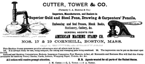
This tin one belonged to Bessie Bayless, from Pennsylvania and Ohio. From the Atlantic telegraph lines, to Pennsylvania and Ohio, to the Fine Arts Club in Fargo, North Dakota, and finally into the hands of someone who obsesses over trivial mysteries, this tin is more than just a holder of nibs: it’s a world traveller and a mystery for the ages — and it’s mine.

Antique Vampire Kits

A Rare and Unusual Vampire Slaying Kit goes up for auction on June 22, 2012, at Tennants Auctioneers:

[C]omprising a percussion cap pistol with octagonal steel barrel, foliate etched box lock and walnut bag butt, a steel bullet mould, a mallet and four oak stakes, a set of Rosary beads, three glass bottles (two labelled Holy Water and Holy Earth), a Book of Common Prayer dated 1857, all contained in a blue velvet lined mahogany casket with fitted lift-out tray, the inner cover set with a gilt metal and mahogany crucifix, the silver lock escutcheon in the form of a cross, 31cm by 23cm by 13cm

The BBC also notes the following details:

As well as the weaponry, the box holds a copy of the Book of Common Prayer from 1851 and a handwritten extract from the Bible which quotes Luke 19:27.

It reads: “But those mine enemies, which would not that I should reign over them, bring hither, and slay them before me.”

Prior to the kit being listed at the auction site, Oonagh Drage from Tennants Auctioneers said, “I’m not sure who will buy it as we are yet to put it on the internet. I know there are quite a few Americans who are interested in this kind of thing.”

Yup, we American are all about the vampire lore.

Drage credits Bram Stoker’s Dracula for, perhaps, inspiring such kits. But collectors today have a much longer line to whet their fantasies — and wet their pants. *wink* From Virginia Dare to the more recent Abraham Lincoln: Vampire Hunter, we even love to incorporate vampires into our American history.

Because of that, one must always consider the faking of such kits by assembling period items in a period box. I’m not in any position to inspect this kit, and I’m not disparaging its authenticity; but I’ve written about these vampire kits before and so must caution collectors about such general issues in this area of collecting.

Drage estimates this antique vampire killing kit to sell between $1800 and $3000; previous sets have sold for close to $15,000. Because we Americans love our vampire collectibles!

If you can’t make it to Leyburn, North Yorkshire, to bid, you can still bid on the 19th century vampire slaying kit; there’s live internet bidding on this item, and others, in Arms, Armour, Militaria & Ethnographica Auction at Tennants.

Wire Money of Earth and Elsewhere

All I know of A Game of Thrones is that the series, which I cannot watch due to a lack of HBO and/or time to devote, looks totally awesome. As with most stories with a devoted set of followers, the replica-makers come up with some pretty amazing stuff. A small mint has produced a set of Game of Thrones money, and I was particularly taken by the Dothraki Puli. This is a “chain” of coins, minted from a single strip of precious metal and designed to be left together as one piece of money, or cut off smaller denominations as needed. I was surprised to see the note from the maker, which says these coins were based on a Russian coin style that was used for nearly a millennium.

The common method for minting a coin is to start with a planchet or flan. This is a disk of the right size and weight for the intended coin, punched from a rolled-flat sheet of precious metals or cast from a blank mold. The disk is then placed between two dies, and are pressed or pounded to leave an impression of the obverse and reverse on each side of the blank. This tends to be more accurate for creating uniform size and weight of coins, although sometimes in the past the coins were cast with their fronts and reverses from the start, but that varied and depended on the material. Bronze, for instance, was a bit too hard for die striking and were cast entirely.

Beginning around 980AD, minters in Russia came upon a novel method of minting coins. They found that it was easier to control the uniformity of thickness and quality by starting with a wire of the precious metal, then cut it into lengths of the right weight, and then strike the coin from those wire chunks. Although the wire was flattened before the die striking, it gave the ‘wire money’ a unique look, oblong with obvious blunt ends were the wire had been cut off. This unique shape earned these coins the name ‘fish scales’ in the Russian language. The simplicity of the process kept it in use until the 17th century and the introduction of modern minting processes, and the last of these coins were made in the early 1700s.

You’ll note that this is quite a bit different than the fanciful Game of Thrones coins above, which retained their wire-like form. Actual minters and financiers would realize a large flaw in the Thrones money quite readily if it were ever used in practice. The weight of a coin in precious metals is something that requires uniformity to ensure that the coin can be trusted to be an accurate payment. “Reeded” edges on coins are designed to foil coin-shavers, people who cut off small amounts off the edges of coins to collect the precious metal and then spend the now-smaller coins at face value. Now, take a look at the Game of Thrones coins. If you were to pull out your string of wire money, you could snip off the requested denomination slightly smaller than needed, and hope that the merchant doesn’t check the weight. Then, you take the extra-long end you just made, and trim it off a little smaller than it should be, too. Do that enough, you get to keep a bunch of the copper or silver while shortchanging the people you do business with. Even the ‘pieces of eight’ were not commonly actually cut into eight pieces, at least not in common money dealings. I suppose, on far-off Westeros, they may have a different way of dealing with these fancy currency, but here on Earth we’re less trusting of hand-cut coins. Although the Shire Post website doesn’t currently have any of their wire coins for sale, real antique Russian wire coins are actually quite plentiful, and can be purchased many places for just a few dollars each.

OMG, I Used To Have A Scarf In The Same Ballerina Print As This Vintage Lingerie!

I still might have the vintage scarf, packed away someplace… If I knew for certain, I’d snap-up this vintage lingerie set in the same ballerina print!

This vintage nightgown and peignoir robe in a pretty ballerina print is made of rayon; tips on caring for vintage rayon fashions can be found here.

Images via Andapanda’s Vintage Clothing.

Bid On Abraham Lincoln’s Hair

Also part of the Americana Signature Auction, is an antique photographic case containing a lock of Abraham Lincoln’s hair opposite an albumen portrait of the president.

Upon Lincoln’s death, apparently a number of locks of the President’s hair were removed as mourning keepsakes. This lock of Lincoln’s hair is approximate 3″ long and ranges in width from 1/2 to 1/8 inches. A small black bow has been added and the spine of the embossed leather case has been repaired with black tape. There’s “impressive” provenance for this historical auction offering as well. Heritage Auction’s estimate is $8,000 – $12,000.

The Americana Signature Auction will be held on May 12, 2012, in Dallas; absentee bidding ends May 11, 2012 at 10:00 PM CT.

Minimalistic Chic Modern & Contemporary Art Auction From The Estate Of Fashionista Janet Brown

Janet Brown: Fashion Tastemaker

While many are excited about the Schiaparelli and Prada showing, there’s an upcoming auction at Freeman’s that fashionistas may also wish to know about.

On Saturday, May 12, 2012, the Modern and Contemporary Art auction contains works from the estate of Janet Brown. Brown was an influential fashion retailer, she and her boutique in Port Washington, N.Y., are credited with bringing forth important designers like Prada — before the designs were famous or even sold in Manhattan. According to The New York Times, “for designers, having their collections stocked by Ms. Brown was often more powerful than staking claim to a floor at Saks Fifth Avenue.”

Because this is an art auction, there won’t be any fashion designer items available. But as a tastemaker, the same unique talent and vision that combined classic design, elegance, premier quality, and avant-garde fashion sense called “Minimalist Chic” is obviously apparent in her art selections.

Among the 18 auction lots (Lots 17-35), there are five figure studies by Auguste Vuillemot (auction estimate $1,000-1,500), and six panels by Louis Waldron, after Andy Warhol (auction estimate $1,500-2,500).

But I think my favorite is the Jacques Villion piece which bears the same title and has compositional similarities to several paintings the artist made in 1921 and 1922 depicting horse racing and jockeys. I love horses and it’s inscribed ‘HAUT’ twice along upper edge.