Vintage Art Deco Glass Embalming Bottle

This is a vintage glass embalming bottle. We’ve sold a number of them — and quickly, at that.

duo-escohol embalming fluid bottle

A product of the Embalmers’ Supply Company (ESCO) of Westport, Conn. USA. (“Manufacturing Chemists to the Funeral Profession since 1886”) the label reads:

Duo-Escohol (Pre-Injection) Incarnadines the Blood! Unit No.1 of the 1-2-3 System of ESCO Distinctive Embalming ~ Incarnadining Agents ~ Synergistic Increment ~ Balsam Principles ~ Double-Base Preservatives

Embalming primarily involves the replacement of bodily fluids with chemicals to prevent putrefaction. (Pre-injection chemicals break up clots and otherwise conditions vessels & bodily tissues, making them more receptive to the embalming process.) That makes this vintage bottle a hot little funerary collectible.

art deco vintage esco embalming bottle label

But even without the label, or knowing that this is a death and funeral related item, the old glass bottle itself is beautiful. It has such great art deco style! Look at that fabulous step-pyramid top, all the embossing, all the details, the measurement guide along the side… Just gorgeous! No wonder these ESCO bottles sell so fast! (Especially so when these bottles have their original paper labels, as all of ours have had.) They have to be one of the most beautiful embalming bottles ever made.

step-pyramid top glass embalming bottle

measuring guide on art deco embalming bottle

ESCO clearly had their own specific glass bottles made. This one is marked:

2
Bottle
Made in U.S.A.
ESCO
Pat Pending

patent pending esco embalming fluid bottle

The patent pending means this particular bottle was likely an early example; Duo-Escohol was first produced by ESCO in 1926.

Such a beautiful, functional, bottle that it certainly is a great statement piece in any funerary or bottle collection. And quite the conversation piece in general.

antique vintage art deco glass funerary bottle

PS One of our bottle did not have the original cap; instead, it had the cap from bottle or step number two in the process — the Duo-Raa-Co.

vintage embalming fluid bottle cap

Profiles Behind Vintage Silhouette Artists Are Shady

I have become completely obsessed. Again. This time, it’s about vintage silhouettes.

vintage silhouette portaits by paul 1934 lady wearing hat

Of course, in general the whole idea of “vintage silhouettes” (from a German village or not) may seem quaint in the 1930s. But remember, by this time it had been roughly a century since the art of silhouettes had been replaced by photographs. Silhouettes were quaint now. And it just goes to show you how we humans have long had a strong nostalgic streak. But there’s more to study here.

While I love the vintage fashionista who was compelled to have not one, but two, portraits of herself done at the 1934 Chicago World’s Fair (and I am quite enamored with her hat — which is either amply feathered or sports an actual bird!), it is the silhouette artist himself which mainly concerns me.

The (roughly) 6 by 4 inch cards of this pair of vintage silhouettes contain the following printed information:

Silhouette Portrait
Cut At The
Black Forest
World’s Fair, 1934
By “Paul”

Why would Paul’s name be in quotes?

Despite the fact that all the information is printed on stock cards, perhaps “Paul” was not one person, but rather there were many paper cutters playing the role of Paul. According to excerpts from letters written by Trudel, a young German Jewish woman who arrived in Chicago in May, 1934, various people worked cutting the silhouettes at the fair. (And *gasp* not all the people in the Black Forest attraction at the World’s Fair were German!)

A couple and a friend from Vienna are cutting silhouettes of people.

…My travel companions from Vienna I see every time I go there. The wife and friend work now in an exhibit called “Black Forest”.

It certainly makes sense, from a manpower point of view, to have multiple artists crafting silhouette souvenirs for fair visitors. However, I still don’t know what significance, if any, the name Paul has to do with cutting silhouettes. Do you?

There is evidence that “Paul” was around creating silhouette souvenirs for folks at other World’s Fairs. At least through the 1964-65 World’s Fair in New York. However, by that time not only were the boards the paper silhouettes were adhered to blacked-out to give the illusion of a a frame with an oval opening, but Paul’s name was given a scripted look (which looks more like a signature — but isn’t, it’s still printed on the paper) and the quotes around his name had disappeared. Also, I’ve also seen silhouettes from World Fairs which had no names or artist identification at all. So it’s more than a bit confusing — to the point where one doesn’t know if “Paul” and Paul are even referencing the same artist (or conceptual artist, as the case may be).

If anyone knows more about Paul, “Paul”, or these silhouettes, please do share. I cannot save (hoard) all these things, but I really, really, really do want to know the story behind old items like this!

Meet Me Down by Schuster’s (Vintage Department Store Memories & Collectibles)

Like many people, my first jobs were in retail. It was work I actually loved; but retail doesn’t pay enough to support a family, so I left it & got a college degree. Years later, I still consider myself to be a “retail brat” — and so I collect vintage retail store items. Like most collectors, I tend to focus on the names that mean something to me. For me, these are the department stores of Milwaukee, Wisconsin.

Vintage Milwaukee Department Store Collectibles: Boston Store Cloth Patch, Schuster's Stamp Book, Gimbles * Schuster's Hat Box
Vintage Milwaukee Department Store Collectibles: Boston Store Cloth Patch, Schuster’s Stamp Book, Gimbles * Schuster’s Hat Box

A recent score was a Schuster Stamp Book. This vintage ephemera piece from the Ed. Schuster & Co. department store, founded by German immigrant Edward Schuster in 1884, may not look like much. But as an early department store chain in Milwaukee, Wisconsin, it is near to my heart.

Vintage Schuster Stamp Book

I myself never worked at or even shopped at a Schuster’s store. Schuster’s merged with another Milwaukee department store, Gimbels, two years before I was born. In effect, that act in 1962 was a Gimbels buyout of Schusters — and the resulting joint “Gimbels Schusters” name was very short-lived indeed. I never quite worked for Gimbels either; however, I did work at the Southridge Mall Gimbels location just after it became a Marshall Field’s store (at the prestigious Estee Lauder counter) which, in but a blink of a glamorous eyelash, quickly became an H.C. Pranges and, just a few more years later, Younkers stores. But even though I have no real personal memories of Schuster’s, I have the shared collective memories of the store.

Growing up, every adult referenced the both Schuster’s (and Gimbels). It wasn’t just that they referred to buildings and locations once occupied by these earlier retailers (you know, in that way people habitually call new companies and buildings by the former names and occupants), but their advertising campaigns were iconic. For example, anyone my parents’ age or older still feels that special holiday magic at the mere mention of Billie the Brownie.

Billie the Brownie was a Christmas character that Schuster’s Department Store introduced in 1927 to promote their annual Christmas Parade in downtown Milwaukee. Billie, Santa’s favorite elf, went on to delight children in radio shows, motivate parents, and, of course, sell products via ads — until 1955, when a Billie the Brownie doll failed to sell in Milwaukee stores. Billie’s last radio show aired on Christmas Eve 1955. But he continues to live on in the hearts of many a Milwaukee Baby Boomer today! (FYI, in his final broadcast, Billie makes reference to “Sandman”, and according to this site, Billie, true to his German roots, went on to live another life in East Germany the following year.)

But enough about Billie. As charming as he is, he does not appear in my vintage Schuster’s stamp book.

What does appear in the pages of this old book is far more fascinating to me. But before we get into that, it would be helpful for you to know a little bit more about Schuster’s history. Especially in terms of store, trade, or trading stamps which were used as a rewards or loyalty program.

For those of you who think that S&H Green Stamps (aka Green Shield Stamps) were the first trading stamps, it may surprise you to know that the S & H (Sperry & Hutchinson) stamps began in 1896 — five years after Schuster’s stamps. In fact, Ed. Schuster & Co., Inc., is credited with founding trade stamps in the Unites States. The program, which began in 1891, ran for 68 years (until 1959, just before merger talks with Gimbles).

Now for the fascinating part.

Stamped rather sloppily inside the the front cover it reads “Valuable Schuster Stamps will be issued on Price-Fixed Merchandise if Chapter 52 is finally determined invalid.”

Not knowing anything about “Chapter 52”, I wanted to research it — but knew having some date or time period would be helpful. So it was time to try to date the old stamp booklet.

While the covers are rather fancy (a deep red or burgundy, with black & white flourishes, in a matte finish), the paper pages on the inside are quite tanned, old & brittle — as in “cheap paper.” Each page of the book as rectangles for the stamps to be placed, surrounding a center illustrated advertisement for Schuster products. On the back, there is a stock code, “I-39”, which leads me to believe it dates to 1939. While there are no Schuster’s stamps inside (bummer), there are clumsily-placed Easter Seals (for Christmas, 1940) which seem to be the work of a child. The date of those stamps make me more inclined to believe that this booklet dates to 1939 – 1940; but who can tell? I mean, a child could have found this old stamp booklet in the same junk drawer as the old seals and put them together in 1960 — or even later.

Inside Vintage Schuster's Department Store Booklet
Inside Vintage Schuster’s Department Store Booklet

So what’s an obsessive collector to do?

Stumbling about the Internet, I was delighted to discover that there was a book about the department store! Of course, it has to share billing with Gimbles, but… Well, at least a book exists! Schuster’s and Gimbels: Milwaukee’s Beloved Department Stores is by Paul Geenen — and since the book has a website, I reached out to the author, telling him, “I have no idea what this ‘Chapter 52’ is… I know a bit of the early history of Schuster’s and stamps (which is why I was so thrilled to have found this!), but I have no idea what this ‘Chapter 52’ is or when it occurred.” Could he, would he, help?

Yes!

Mr. Geenen replied:

I found a very similar coupon book at the Milwaukee Historical Society when I was doing the research for my book, Deanna. You have one of the few around.

I believe that the book you have was issued and filled with stamps during WWII, when there was strict price fixing. Stores were not allowed to raise prices and were restricted in using the word” sale” when they advertised.

I don’t know what Chapter 52 is for sure, but by the language it appears that Chapter 52 was the fixed price legislation. So what they were saying is that Schusters stamps would be issued if the item was not on the price fixed list.

Issuing the stamps was like putting an item on sale and during the war putting an item on sale was discouraged as it would encourage people to hoard.

How exciting to know what I have is rather rare! And now, thanks to Mr. Geenen, I have more pieces to the story!

I haven’t quite closed the book on this bit of Schuster’s history. But I’ve put a (metaphoric) pin in the Schuster’s Stamp Savings Story for now. …A collector is never quite finished.

PS The title of this post is from (one of the variations of) the old Milwaukee saying, “Down by Schuster’s, where the streetcar bends the corner around”, which lives on as proof of Schuster’s duration.

All images are copyright Deanna Dahlsad; you may use with proper credits — including a link to this article.

Back of Milwaukee Department Store Book

Finding Frank Fritz

Frank Fritz may be one-half of the American Pickers (or one-third, if you include Danielle), but Fritz is not partners with on-air partner Mike Wolfe in Antique Archaeology (neither in LeClaire nor Nashville). However, Fritz has his own shop in Savanna, IL, called Frank Fritz Finds.

Frank Fritz Finds

According to Barb Ickes at the Quad-City Times, the store resides in part “nearly an entire city block” owned by Jerry Gendreau. Here’s another photo of the shop, from Shad V.

frank fritz's antique shop

It may or may not amaze you, given how savvy you are about TV show deals, etc., but I personally find the American Pickers branding that down-plays Fritz  and his store to be, well, a bit of a downer.  However unintentional the confusion is regarding the business relationship between Mike & Frank, it certainly is debatable; especially as Danielle constantly refers to Wolf & Fritz as her bosses.

Perhaps the show should make a stop at Frank Fritz’s shop now and then. Even just to drop something off. Even if they do, I might just have to make a road trip there myself. *wink*

If you are a fan of Frankie, check out his Facebook page. (And Frank Fritz Finds has it’s own page too.)

frank fritz in his antique shop

I Am TOM. I Like to TYPE. Hear That?

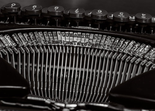
For less important doodles in text, the kind that go no farther than your desk or refrigerator door, the tactile pleasure of typing old school is incomparable to what you get from a de rigueur laptop. Computer keyboards make a mousy tappy tap tappy tap like ones you hear in a Starbucks — work may be getting done but it sounds cozy and small, like knitting needles creating a pair of socks. Everything you type on a typewriter sounds grand, the words forming in mini-explosions of SHOOK SHOOK SHOOK. A thank-you note resonates with the same heft as a literary masterpiece.

The sound of typing is one reason to own a vintage manual typewriter — alas, there are only three reasons, and none of them are ease or speed. In addition to sound, there is the sheer physical pleasure of typing; it feels just as good as it sounds, the muscles in your hands control the volume and cadence of the aural assault so that the room echoes with the staccato beat of your synapses.

See on www.nytimes.com

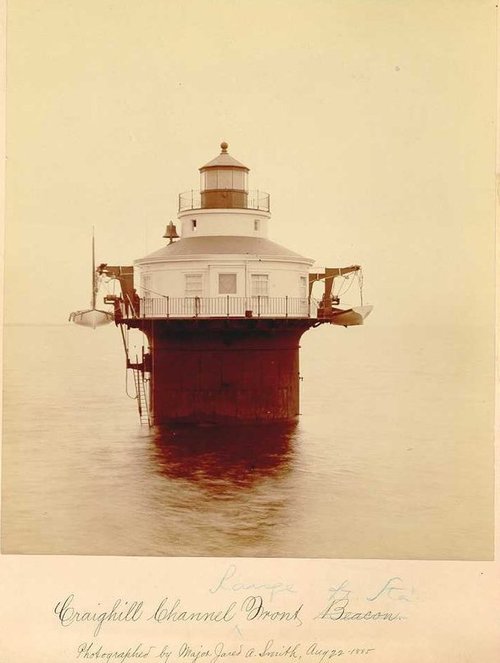
Original 1885 Chesapeake Lighthouse Photographs Mounted Albumen Prints

Looking for some assistance in pricing and marketing a set of 9 mounted albumen prints of Chesapeake Bay lighthouses.

Prints are part of a series of photos taken by Major Jared A. Smith for the US Lighthouse Establishment in 1885. Research has shown that the USCG Historian’s Dept has copies of some of these prints but for other locations the reference shows “Photo Unavailable”.

Deanna Dahlsad‘s insight:

Have any info to share?

See on iantiqueonline.ning.com

Antique Flat Top Trunks

Awhile ago I received an email from Emily regarding an antique trunk article I wrote roughly two years ago:

I saw an article you wrote about antique trunks and there is a picture of one trunk that I would like to know if you know anything about it. I have the same one. It says patd. oct 2 1888 on the front lock.

I do not know much about trunks or their makers (nor am I an appraiser), but since Emily and I are related via the adoption of sibling antique steamer trunks, I’d try to share what little information I have…

Antique Trunk
Antique Trunk
Our trunks are classic flat top trunks, rectangular boxes covered with sheet metal (called metal backgrounds — some trunks have canvas or burlap backgrounds) and hardwood staves with additional metal trim and hardware. These trunks, produced in great numbers by various manufacturers worldwide between 1870 and 1920, were true shipping workhorses, stacked in cargo holds of ships.

These trunks are not steamer trunks; true steamer trunks (about half the height of most regular flat top trunks) were the trunks passengers were allowed to keep in their quarters during steamship voyages. Whatever was in the smaller steamer trunk was what they had access to during the trip; all other trunks and their contents were inaccessible, stored in the cargo hold until the end of the voyage.

The sheet metal used was typically plain old flat tin, but often you’ll find the metal embossed to look like canvas. Some people have questioned why such embossing would be done, when canvas would have been cheaper than sheet metal — let alone embossed sheet metal. I suppose that this could have been done to disguise a more expensive trunk — eyeballing it, a person perhaps wouldn’t notice it as different from the cheaper canvas backed trunks. But a porter would certainly notice the difference in texture and weight.

Antique Trunk Open
Antique Trunk Open
Primarily, trunks embossed with more ornate patterns, like ours, were surely designed to appeal to buyers. And they continue to appeal to us today — the more decorative antique trunks are, the more they are sought after.

Being that such large objects are certain to be not only on display, but noticeably so, collectors and those of us who find the practicality of trunks compelling, looks matter. The most beautiful are the domed or rounded-top trunks, but, as I said in that other article, I personally don’t own a single round topped trunk:

It’s not just the price which keeps me away from them. The same reason these trunks were coveted back in the day is the same reason I dislike them now: you can’t set anything on top of them.

Not only do I like to stack my trunks, but I like to use them as furniture. If the top is round, you can’t set a lamp or candle holder on them, nor books and a beverage. In a small house, anything that doubles as storage and a piece of furniture is a-OK with me.

However, clever porters storing trunks quickly realized that round-topped trunks set on their backs, fronts or sides gave a flat ‘top’ which could be both stacked and stacked upon. If it’s hard to visualize, imagine the the round top of a trunk like the spine of a book:

stacked books

This is a novel idea for display of antique trunks too; however, it will require thinking about using them for storage, as the lids will now open ‘out’ rather than ‘up’ allowing for items inside to spill out.

Inside Footlocker
Inside Footlocker
Most trunks once had wooden trays inside, but these were flimsy (poorly constructed from soft inexpensive wood) and so the inside ‘lip’ to set trays on is the only remaining evidence. Trunks found with trays usually aren’t worth that much more, as the wood is brittle and disintegrating, unable to be of much use — and even the most appealing parts of these trays, the pretty printed wallpapers papers (or fabric), are usually too tattered, mildewed and water stained to really be enjoyed. If your trunk, trays and/or compartments have wallpaper, pictures, or cloth intact it could be worth more to collectors — but generally speaking, only if the outside and original hardware are in equally wonderful condition.

In general, flat-top trunks fetch lower prices than their round or dome-topped relatives, and, unless they are incredibly spectacular, they have little monetary value past storage and decorative objects. ‘Round here, you can get them for as little as $1 at an auction — though in retail settings, perhaps up to $150 or so (but those dealers will wait awhile for that sale). I don’t think I’ve paid more than $15 for an antique flat top trunk myself.

Prices will vary with your location, as always; but keep in mind that the large size of antique trunks limits the size of a collection more than figurines etc., so demand, in general, is lower and so the prices are lower.

Not All Disney Princesses Were Legal

In the 1920s through the 1940s, carnivals, state fairs, and the like gave away figurines made of plaster to those who successfully answered the calls of carnival game barkers. Because they were made of plaster or chalk, these pieces are called carnival chalkware. Given that they were made of a less-than sturdy material as well as given away to men trying to impress ladies and kids (both temporary conditions!), relatively few of the rather large number of plaster carnival prizes made and given away have survived; thus making them collectible.

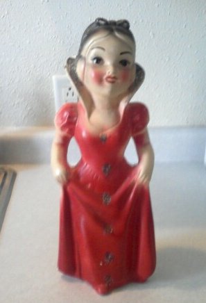
The most popular of these pieces, then as now, are those depicting famous people, personalities, and icons of those times — including non-real folks, such as beloved comic and film characters. And not all of these were approved or licensed creations. Like my vintage Snow White carnival chalkware piece.

snow white knock-off chalkware

While characters such as Snow White and Cinderella (and their stories) are in the public domain, it’s pretty clear that the makers of vintage carnival chalkware pieces were ripping-off the intellectual property of Walt Disney.

Disney characters weren’t the only ones to be copied in plaster, but they seem to be among the most popular — both in terms of having been saved by original owners and in collector desirability. A true testament to the longevity of Disney.

Authentic Antique Pioneer & Farm Homesteading Ephemera

Found here in North Dakota, this antique promotional booklet is an authentic piece of pioneering & homestead farming history! Compliments of Samuel Lange, a dealer in Farm Machinery, such as Buggies and Carriages, Cream Separators, Plymouth Twine, Defiance Listers & Plows, La Cross Disk Harrows, pioneer Buggies, Surries & Wagons, agent for Queen City Creamery Co. “Highest Paid Prices for Cream.”

Also noted inside the front and back covers, Mc Cormick Binders, Mowers & Hay Rakes, Plano & Mc Cormick repairs, Racine Cultivators & Plows, Wenzelman Steele Grain Dump, Empire Ball Bearing, Neck Bearing Cream Separator.

Inside, the little book from 1908 is filled with facts — from foreign currency conversion to census data, from color maps to business laws, and more. Plus, there are pages for the owner to write down addresses, notes, ledger details, and calender dates.

Booklet measures 5 and 3/4 inches by 3 inches and is available for sale in our Etsy shop. Also included, a small piece of handwritten ephemera which was found inside and we feel should remain with this lovely old piece.

Vintage Industrial & Primitive Candle Holders

Vintage dairy cream separator funnels have a great industrial look — and a great primitive look when rusty.

They make great candle stick holders!

If you plan on lighting the candles, you should place them on an appropriate heat resistant/fire-safe container — antique saucers and plates work well for this and you can even mix and match leftover saucers or find a use for those in not-so-great condition. You might even want to weave some lace or ribbon in the holes to play up the textures against the old metal. …And if you are using ribbons and things, why not add some vintage buttons too? There are lots of possibilities.

Vintage Casino Chips For Framed Wall Art

Are you a heavy collector of weird (as others may perceive) yet cool stuff? Want to try something new to hang on your wall? Usually, it’s a painting, a cross-stitch, a vintage movie poster or a celebrity sketch that would make a sophisticated and noticeable framed wall art. For this year, here is the challenge: why not come up with a framed artwork featuring the oldest casino chips that you can find? One might argue that this is an expensive and a very difficult challenge for hobbyists and collectors like me. Poker chips are unique to every casino. The designs before are so intricate as compared to the latter ones. As opposed to coin collecting, this is not an expensive variety of exonumia for these tokens aren’t made of silver or gold.

If you intend on pursuing the project, you can either collect in person or purchase online. My Vegas Chips online sells poker chips manufactured from 1930s to 1960s at a reasonable price. You can never tell if those vintage chips have been used by artists, musicians or famous poker players who played in the casino. You can also purchase some from your online friends over at Partypoker.com. The largest virtual poker room aside from offering virtual casino games also provides a virtual community and social lounge for members to interact. You might meet someone who’s also a collector or someone who’s a son-of-a-poker-legacy who happened to have an old chip to dispose of.

Below are some of the surprisingly cheap vintage chips (price range from $15 to $35) that you can purchase from My Vegas chips:

ROULETTE SILVER PALACE YERINGTON
This obsolete old vintage casino chip was manufactured in the 1930s. There are plenty of stocks left dedicated for avid collectors. It is available in yellow, brown and navy blue colors. There are no signs of warping and the golden engraved Silver Palace Yerington Nevada is still visible and clear. The size of the chip is 39mm in diameter. A bubble wrap case is included upon delivery for protection.

HARRAH’s CLUB RENO LAKE TAHOE
Harrah’s Club Reno casino is still operational as of date but you can’t purchase this rare poker chip manufactured in the 1960s if you are planning to go to the casino today. Actually, this rare chip is still on stock but the conditions are slightly used. It will still easily stand on edge. Although there is a slight scratch on its body, the golden imprint is still visible against the pink colored chip with four gray spots each side around the chip.

CONTINENTAL LAS VEGAS NEVADA CASINO POKER CHIP
For a price of only $7.00, one can purchase this lime green poker chip with a golden engrave of Continental Hotel Casino in the late 50s. What’s special about this chip? There is a polished detail around the chip which shows a flower, spade, heart and diamond.

Oh, The Places You Will Go!

On shows like American Pickers or Pickers Sisters, every once in a while the pickers go into some unassuming building and find themselves someplace surprising, a place where the outside doesn’t betray what’s inside. It might seem like TV magic, something that doesn’t happen in the real world, but my Wifey and I ran into our own “picker moment” recently.

Just after Christmas, Wifey was hanging out down at the antique mall. While she was chit-chatting with the manager, a guy came in looking to sell some things. His mother had moved into assisted living and he had been put in charge of liquidating the farm, so he was looking for a picker to come out and buy some stuff. Wifey said, sure, we’ll come out and take a look.

We bought a vanload from him the first time out, and he had said that some other time we should come back and see what’s in the barn. Now that’s what we’re talking about: the good stuff is always in The Barn, at least from our perspective. We had been polite and taken time to talk with him about his mom, his family, and how hard it is to clean out a house, and we let him know how much we thought the various items were worth or how old it was, even if we weren’t going to buy it. It turns out he had talked to another dealer first — that dealer had been brusque, bought a couple things and quickly left. Little did that dealer know he missed out on the offer of The Barn by not taking his time as a picker to be polite and get to know the seller first.

Due to weather and other conditions, we couldn’t get into the barn at that time. Finally, this past weekend, Wifey got a text from him, saying we should come out to the farm again. We thought it was about some other stuff we were interested in buying but he hadn’t made a decision, but we didn’t go in the house — he met us in the yard.

Turns out, he wanted to take us out to The Barn.

The snow was a little over a foot deep, but we had brought our boots, so we started to trudge across the farmyard out to the classic gambrel barn at the north end of the property. The first floor was your average barn fare – bicycle parts, old farm tools, a rusty bedspring, so we made a pile by the door. While we were climbing on the piles of abandoned treasures, picking through buckets of doorknobs and pipe fittings, our host had disappeared. When he returned, he said, “all the good stuff is upstairs.”

He led us around to the side of the barn where he had pried open a door. We had to climb over an old rusty drag to get onto a steep set of stairs. As we climbed, D gazed at all of the old rough-cut gambrel rafters and said, “wow, all this wood is very cool.” I was just ahead of her, and when I reached the top of the stairs, I said, “if you’re impressed with that, just wait until you get up here.”

The floor of the hayloft looks like it hadn’t ever seen a single piece of straw. At the far end of the loft was a stage. The stairs we came up were the back stairs; on the other side was the main stairs, straight and not as steep, but blocked from the outside. Long benches flanked each side of the wide-open space. Signs warned against leaning on the hayloft door and advised care walking on the stairs. This wasn’t a farmer’s barn: this was a barn dance barn.

It didn’t take long for us to put two and two together. In the first batch of stuff we bought from this farm, we found a matchbook advertising Ida Carlson’s Barn dance-hall. I knew there were a bunch of barn dance-halls in the area back in the day, so I figured Ida’s barn had to be pretty close to Fargo. Standing here, at the end of a polished hardwood floor in the upstairs of a barn, I was actually in Ida Carlson’s Barn.

Our host was Ida Carlson’s grandson, and after Ida retired from the dance hall business his parents kept it going until the 1980s. The heyday of Ida Carlson’s Barn was the 1930s to the 1940s. The barn was built in 1934, specifically to host dances; it — and the outhouse, of course — were the first buildings on the property. Ida got her permit to run barn dances in May 1934 and ads for events at the Barn started appearing in the Moorhead Daily News almost immediately. She applied for a beer license, too, but the county declined, saying having beer and barn dances in the same place “would be against the public interest.” Ida Carlson’s Barn became a popular youth hangout for all the usual reasons that young people needed a place out of town, away from their responsibilities, to hang out with other youths. It’s where people met their life-long spouses, and the NDSU Spectrum even joked that the closest that their female students “have ever been to a cow, probably, is at Ida Carlson’s barn dance.”

The barn hadn’t seen a dance in about thirty years; our host’s brother has a band, and it’s his equipment on the stage today. Before we even started to look at treasures to buy, we got more stories about Ida’s barn and a brief tour, including the wooden railing where fifty years of bands wrote their names on the boards. When we finished our picking, as we drove away from the farmstead, our conversation was more about Ida Carlson’s Barn than any of the things we bought.

An Axe To Grind For Thanksgiving?

Circa 1946, Jeanne Crain sharpens an axe on an old blade grinder — while the poor potential victim, a turkey, looks on.

A few years ago, we gave my dad a similar looking grinder… I hope he’s not using it to sharpen a blade for our turkey!

Our best wishes to you for a wonderful Thanksgiving holiday!

Soapy Money: Coupon Check Trade Tokens

Last week Wifey and I were hanging out at our local antique mall when a woman came in wanting to sell a Tupperware full of bits and baubles. Among the jewelry and silverware was a small jewelry-sized baggie full of tokens. Although I’m no help when it comes to jewelry, Wifey was glad I was around to evaluate the tokens. As you may have noticed, money and money-like things are one of the things I collect. The baggie held some generic arcade tokens, a nice Sioux City transit token that went into my collection, a few southeast Asia Playboy Club tokens went into Wifey’s collection, but the rest were a variety of trade tokens.

Today, some retailers have gotten all high-tech by distributing deals by texts and the internet, but even paper coupons are barely more than a hundred years old. Coca-Cola is considered the creator of the modern coupon, offering free drinks in hopes of hooking a lifelong customer, and once it proved effective for Coke other products followed suit.

Coca-Cola Coupon

Soap, of all types and uses, was a commonplace product that was just growing in demand in the early 20th century — regular washing and bathing was an uncommon experience until Victorian times — and each new entry into the market needed to elbow its way into people’s kitchens and washrooms. The reason people still watch ‘soap operas’ hails back to one of the most successful soap marketing methods, making Procter and Gamble one of the more successful television production companies today. Coupons for free products, like Coca-Cola’s successful plan, became one of the soap industry’s more successful efforts to get their products into the hands of customers.

The soap coupon tokens I have are also rooted in an earlier type of token: the trade token. Trade tokens were issued by a business, municipality, organization, or other group as a sort of fiat currency. Regular customers could earn a trade token through repeat patronage, or as an encouragement to shop at an institution. They were often marked with the business’ name, and a value in money or product. These were truly tokens, not just coupons, made of metal and sized to be similar to other currencies of the time. People carried them around in their changepurse and used them as currency when applicable. Quite often they were good for fifty or twenty-five cents — a couple dollars in today’s money — at a general store or specialty shop, but you can easily compare a saloon providing trade tokens good for one drink to Coca-Cola’s coupon plan. Trade tokens lasted through the end of the nineteenth century, but slowly faded out at the beginning of the twentieth century.

Coupon tokens did survive in some corners well into the twentieth century, particularly if you remember Sambo’s coffee tokens or Country Kitchen coins. Those soap companies, who offered all sorts of freebies and offers in many different forms, found the greatest value in making coin-shaped coupon tokens. One benefit the soap companies found was that the metal tokens could be easily included in the packages of soaps, which often lived in wet places, without running the risk of damage that a paper coupon might encounter. The tokens also found their way into customers’ hands via mail, and their portability and resilience made them easily pocketable and carried about.

The Palmolive company and James S Kirk Co were the biggest producers of these coupon tokens, mostly during the 1920s. The tokens were often called “coupon checks”, because they had an actual monetary value to the retailer that accepted the coin. Retailers were welcome to accept the tokens if they chose, and could get a banner to show off their participation, but a review of old newspaper ads showed that the attempt to redeem tokens was so common that retailers who didn’t participate said so in their ads, to avoid having to refuse the tokens in the checkout line.

These coupon tokens were mostly aluminum, and some bronze, and they came in a variety of shapes and formats. Some were circles, like their money counterparts, but soap tokens could also be square, rectangle, octagonal, or oblong ovals. Most were on the large side, an inch or more in diameter, and many even had a hole in the middle. The wide variety of shapes and sizes makes for a collection as varied and interesting as any foreign coin collection, and the tokens are surprisingly common. This makes soap coupon tokens a cheap introduction into the art of exonumia, from an antique and unique perspective, without breaking the bank.

A Trip To Hippie Tom’s

In May, I went with my parents to an open house at Hippie Tom‘s farm. (If you don’t completely recall the name or recognize him, Hippie Tom is a fan favorite on American Pickers.)

Walking about Tom’s farm is phenomenal. There’s almost too much to take in!

Along with the incredible vintage and antique pieces, mostly organized by theme (sometimes obvious, sometimes personal — enough to inspire by itself!), there are many repurposed and recycled pieces and project ideas to be seen.

My favorite building was the church. The photo doesn’t do the scene justice… The church sits down in a little valley, like it opens up before you, yet somehow in the distance… Inside there was a mix of religious items and a few oddball works of art which showed a sense of humor.

Then again, Hippie Tom’s joie de vivre and humor are exposed everywhere!

Hippie Tom is clearly a fan of collecting shows; this vintage stroller had a paper label with “as seen on American Restoration” on it!

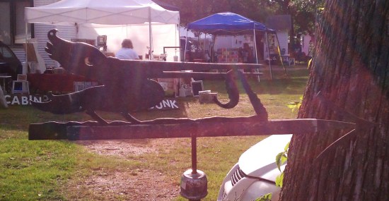
Among the items I purchased at Hippie Tom’s was this antique pelican weather vane. (Something I sniffled about selling last weekend!)

Hippie Tom’s place is called Serendipity Farm — and I also bought one of the old Serendipity Farm signs which Hippie Tom happily signed for me!

That autographed sign is not ever going to be up for sale! But if you want something from Hippie Tom and can’t get to his place or a sale he’s at, check out the merchandise at his website.

A Back To School Primer On Collecting Vintage Dick & Jane Books

Dick and Jane books are among the most popularly collected school books. This is because the series of books was used for over 40 years in American schools. That’s millions of children who were taught by Dick, Jane, Sally, Pam, Penny, Mike, their neighbors, families, and pets! Here’s a bit of history on the vintage Dick and Jane series of books.

In the late 1920s, Zerna Addis Sharp sought out William S. Gray, a renowned educational psychologist and reading authority from the University of Chicago, and pitched to him her philosophy that children are more receptive to reading if the books contained illustrations related to them and their lives. Gray was impressed enough to hire Sharp. While illustrations of the family Sharp created were published in earlier versions of primers by Scott, Foresman and Company, it wasn’t until later that Dick and Jane would appear by name.

In 1930, Gray and William H. Elson, along with May Hill Arbuthnot, created the Curriculum Foundation Series of books for Scott, Foresman and Company.  Here Dick & Jane and their family appeared in the first edition of the Curriculum Foundation Series pre-primer called Elson Basic Readers. In this edition, the baby sister was not named yet (she was simply called “Baby”), the cat was called “Little Mew”, and Spot, the dog, was a terrier.

In 1934, the pre-primer was renamed Dick and Jane and a second book, also a pre-primer, More Dick and Jane Stories, was added. In 1936, the series title changed to Elson-Gray Basic Readers to acknowledge Gray’s role in the series (Sharp was not acknowledged, despite what would be a 30 year career at Scott, Foresman & Company). Eleanor Campbell and Keith Ward did the illustrations, and Marion Monroe also authored some of these early editions of the Dick and Jane books.

Scott, Foresman and Co. retired the Elson-Gray series in 1940, but Dick and Jane remained in the Basic Readers and their Think-and-Do workbooks. Now the baby sister is named Sally — and she gets a teddy bear named Tim, the cat becomes Puff, and Spot becomes a Cocker Spaniel. New books in the series were introduced in 1940 and 1946. In Canada, English and French versions of the Dick and Jane books were translated and published by W.J. Gage & Co., Limited; and British English versions were published by Wheaton in Exidir in the UK. Official Catholic editions of the series, the Cathedral Basic Readers, were created to teach religious themes along with reading. For example, Sally, Dick, and Jane was retitled Judy, John, and Jean to reflect Catholic Saints and to include stories on morality. In the 1946 edition, Tim the teddy was removed and a toy duck was added. Also, Texas had its own editions of the the books in 1946. Another author, A. Sterl Artley, began writing Dick and Jane books in 1947. By the end of the 1940s, the Collection Cathedral was published for French-Canadian Catholics.

By the 1950’s, over 80% of first-graders in the United States were learning to read with Dick and Jane. New editions whose titles began with “The New” were added, and Robert Childress would become the illustrator. But it was during this decade that Dick and Jane et al. would find themselves under strong attack. Concerned groups criticized everything from misrepresentations of perfection and other cultural issues to matters of literacy itself. In 1955’s Why Johnny Can’t Read, Rudolf Flesch blamed the look-say style of Dick and Jane readers for not properly teaching children how to read or appreciate literature. While phonetics were always a part of the Dick and Jane series, there was not enough for the growing movement of phonics fans. For all of these reasons, most of the major changes to the Dick and Jane series occurred in the 1960s.

In 1962, Helen M. Robinson was the new head author, the books had new material (including more phonics), new illustrations by Richard Wiley, and Dick and Jane had matured, in age and sophisticated. The initial printings of the 1962 soft-cover Dick and Jane books increased in page size and did not have the white tape reinforcement on the spine. The covers of these editions fell off rather easily — which is why they are so hard to find with covers intact.  As a result, Scott, Foresman and Company added the reinforced taped spines and advertised the feature heavily. (These books were never issued as hardcovers; any hardcover copies were either library bindings or were rebound later.)

But in 1965, both Civil Rights school integration and President Lyndon B. Johnson’s Elementary and Secondary Education Act would continue to challenge the book publisher.

Scott, Foresman and Company worked to address the school integration and inclusion issues by once again employing Zerna Sharp’s literacy philosophy. The African-American family, including twins Pam and Penny and their brother Mike, first appeared in the 1964 Catholic School books; public school students were introduced to the African-American family in 1965. (In response to outrage from racist complaints, Scott, Foresman & Company offered alternative covers of the 1965 integrated books; these Child Art editions removed the characters from the covers and replaced them with finger-paint art designs. Later editions of Think and Do books just had solid color blocks.) Also in 1965, the Pacific Press Publishing Association published an integrated version of Fun With Dick and Jane for Seventh-day Adventists. Entitled Friends We Know, Jesus appears on the covers along with Dick, Jane and Mike.

In the mid 1960s, Scott, Foresman and Company tried to address the phonics issue by introducing books in an experimental language called Initial Teaching Alphabet or ITA. The Experimental Edition of the Scott-Foresman pre-primer was titled Nou Wee Reed. These ITA Dick and Jane books are rare finds.

In the late 1960s, the Dick and Jane books expanded to include three new series based on academic performance. For those performing below grade level, there was Open Highways. (Original printings of these books had “The Open Highways Readers” printed on the spine; later printings just had “Open Highways”.) For strong readers, Scott, Foresman and Company added Wide Horizons, self-directed readers which did not have workbooks, and for even more advanced or gifted readers, there was also Bright Horizons. Reading Inventory tests were added to the Dick and Jane series to use as a placement guide.

Despite all Scott, Foresman and Co. tried to do, the book publisher just couldn’t overcome all the objections, especially those regarding the too-perfect Dick and Jane world. The goody-goody kids and their ideal gender stereotyped simplicity was no longer relatable or desirable.  The series was officially ended in the late 1960s, replaced in 1970 with Scott, Foresman Reading Systems. (However, in 1975, the 1962 pre-primer was republished by the American Printing House for the Blind in a large type edition with black and white images for sight-impaired children.) Still, Dick and Jane books continued to be ordered and sold from warehouse stock well into the 1970s.

The books Dick and Jane collectors are searching for today are those which managed to be saved — and held onto — by teachers, staff, and students, despite the fact that many schools were even ordered to destroy all remaining copies of works in the series. For these reasons, along with the usual wear and tear of children’s books, finding vintage Dick and Jane books in pristine conditions is very difficult. Collectors learn to live with writings, doodles and marks, missing pages, etc. — or pay steep prices for not having signs of use.

Over the decades, many Dick and Jane materials were produced. Along with the readers and primers mentioned, there were other subject books, such as art, health, math, etc. There were teacher editions; books on teaching techniques; large display books placed on easels, called Our Big Book; posters and picture cut-outs for classroom display; picture and word flash cards; LP record albums; games for the classroom; and other teaching aids.

On the business end, Scott, Foresman and Co. sent out catalogs, newsletters, and promotional items, such as calendars, greeting cards, and Christmas ornaments. These items were produced in much smaller quantities and, being ephemeral in nature, are rare finds.

But Dick and Jane live on.

In 1977, George Segal and Jane Fonda would star in Fun with Dick and Jane, a film based on a Gerald Gaiser story about the failed promises of a Dick and Jane perfect world. (The film was remade with Jim Carrey and Tea Leoni in 2005.)

In 2003, Grosset & Dunlap rereleased original Dick and Jane primers, selling over 2.5 million copies in just over a year even with a publisher disclaimer that the books were nostalgic and not to be used to teach children to read. Due to the popularity of the reissue, reproductions and new related merchandise featuring the iconic imagery and catch phrases, like “See Spot run!”, has been produced.

Additional Resources:

A rather complete list of original Dick and Jane books is here.

Carole Kismaric’s Growing Up with Dick and Jane: Learning and Living the American Dream captures the nostalgia while tracing the cultural points of the Dick and Jane series.

Image Credits:
(In order they appear)

Our Big Book, Dick and Jane Teacher’s Classroom Edition, via into_vintage.

First Dick and Jane book, the 1930 Elson Basic reader, via Tiny Town Books & Toys.

Set of 11 vintage Dick and Jane readers from the 1940s and set of 13 readers from the 1950s, via Wahoos House.

The 1963 Judy, John And Jean New Cathedral Basic Reader, via Keller Books.

Set of 13 books from 1960s, via Wahoos House.

A set of 1930s Dick and Jane flashcards, via Wahoos House; vintage Dick and Jane Blackout Game, circa 1950s, and 1951 Poetry Time three-record Dick and Jane set, narrated in the voice of May Hill Arbuthnot one of the original Dick and Jane authors, via Tiny Town Books & Toys.

The 1954 Scott, Foresman and Company Dick and Jane sales catalog, via Tiny Town Books & Toys.

What Is Mid-Century Modern?

If you’ve spent any time talking with other collectors, antiquers, dealers, or folks who just enjoy watching the plethora of collecting shows, you’ve been hearing an increase in the term “mid-century modern.” Loosely applied, the term can mean anything made in the middle of the last, or 20th, century, usually 1940-1960. But more aptly, the term applies to a design aesthetic which embraces the marriage between function and form — with a simplicity of style born of the artistic and cultural movement of Modernism. And because of the “modern” in “mid-century modern”, the style dates back much further than the name implies.

Modernism is more than just an artistic style; it’s a cultural movement. The movement’s origins go far back as the 1880s, to Germany before the first World War. Despite, or perhaps because of, the prevailing conservatism, there was an increased interest in what the Germans considered the very American notion of usefulness — or, as Dennis Crockett phrased it in his book, German Post-Expressionism: The Art of the Great Disorder 1918-1924, the “predilection for functional work.”

This philosophy, called Neues Bauen or New Objectivity, was first or most notably employed in addressing the German housing crisis of the time. The physical design application of New Objectivity resulted in design innovations in architecture, in which the commercial need for cost-effective housing was met with a radically simplified yet dynamic functionalism, offering simplicity, health, and beauty for the occupants. This solidified the notion that mass-production was indeed reconcilable with individual artistic spirit — it meant affordability — and it was something the famous Bauhaus would build upon when it was founded by Walter Gropius in 1919.

Widely acknowledged as the the first academy for design in the world, the Bauhaus manifesto includes the declaration “to create a new unity of crafts, art and technology.” It was here students and artists would focus on the craftsmanship and the manufacture of works in a collaborative setting, “to produce a work that is not limited to its purely aesthetic meaning, but supports and even influences the transformation of social reality and thus shapes a new society.” And at this time, the transformation desired was a modern one of simplicity and functionality. (For more on the Bauhaus movement and the artists themselves, I highly recommend a book I’ve been reading The Bauhaus Group: Six Masters of Modernism, by Nicholas Fox Weber. It’s fascinating!) Here is where mid-century modern truly begins.

Because the Bauhaus produced more than a mere decorative style, because it pushed the values and needs of a modern world, the school, the artists, and the works created would inspire many others throughout the (mainly Western) world. Spurred on by urban living and the rapid development of plastics and other materials, mid-century modernism became quite popular.

Some of the most known — and collected names — in what we now call mid-century modern, were influenced by the Bauhaus and the movement. They include Americans Ray and Charles Eames (who made fabulous toys too!); Brits Robin Day and his wife Lucienne, and Ernest Race; the Japanese designer and sculptor Isamu Noguchi; and Scandinavians Børge Mogensen, Arne Jacobsen, Finn Juhl (PDF), and Hans Wegner. (Because of the latter design giants, mid-century modern overlaps with, and is often confused for, Scandinavian or Danish design. Here the date of creation and manufacture help make the final decision.)

Here’s a photo of mid-century modern designers George Nelson, Edward Wormley, Eero Saainen (who died not long after this photo was taken), Harry Bertoia, Charles Eames, and Jens Risom for an article in Playboy, July 1961.

Furniture wasn’t the only thing affected by mid-century modernist design. Other functional household objects, such as clocks, radios, and lamps (this was the start of lava lamps!) were made — and are heavily collected today.

Housewares, kitchenalia, and decorative items also got the mid-century modern treatment. You’ll see lots of geometric yet sleek pottery and glassware with embossed patterns and lines of the mid-century mod design. While there still were the more traditional shapes and forms, some with more elaborate and fancy painted designs, made during this time too (Hey, not everyone hops on the trends!), the mid-century modern look is most readily identified by its design simplicity. The decorations seem to better fit the form and function of the piece. Look for pieces in solid colors with embossed designs which seem to flow along the lines of the piece rather than appear applied to it. And remember, one of the primary influences of the movement was purposefulness; meaning the design is wed to an item of purpose and function. When it comes to pieces of decorative turquoise California pottery, for example, there’s less usefulness and practicality than there is with a chair, lamp, or piece of refrigerator glass… However, the style is often represented in these pieces more decorative than functional items and collectors do like them.

Mid-century modern as a category of collecting dates from the 1930s through the mid-1960s. Because of the dates involved, mid-century modern overlaps, influences, and to some degree encapsulates designs from the Atomic Era, Space Age and Googie design, California Modernism, etc. These innovative and popular designs of the 20th century not only pioneered modern furniture and industrial design, but are now the iconic pieces we think of when we think of these decades.

Truly defining or identifying mid-century modern pieces may be difficult; but like Justice Potter said of pornography, you’ll know it when you see it.

Image Credits: (In order images appear.) Photo of Keck & Keck home, via; photos of the Bauhaus Haus am Horn kitchen, 1923, and containers designed by Theodor Bogler for the kitchen and the Josef Albers set of four stacking tables (1927), via; designers photo from Playboy, via; and photo of vintage mid-century modern Westinghouse beige pottery refrigerator-ware pitcher, via.

Don’t Throw In The Towel: Antique Advertising Tin Has A Hold On Me

I found this antique tin advertising piece at the flea market this past Sunday. The little clay marble or ball inside it intrigued me… At first, I wasn’t sure if it had inadvertently stuck itself in there, but it rolled back and forth freely and there was a hole in the back that looked like a manufacturing punch to insert the ball. I played with it a few minutes… Rolling the ball back and forth. Not the worst game ever; but not exactly riveting either.

An older man watched me playing with the piece, so I looked up and asked him, “Do you know what this is?”

“Advertising…”

“I know,” I responded politely, “But what was it for?”

By now another older man had joined us and they both simultaneously replied, “It’s a towel holder.”

Ah, so that was it!

Having played with it, I decided to honor the dealer’s time (and patience) by buying it. Then returned back to hubby, who was waiting in our sales booth (yeah, we were supposed to be making money, not spending it; but that’s how flea markets go!) I was pretty sure if I’d never seen one, I could stump him.

I should have known better. He knows pretty much everything.

“Guess what this is?” I goaded.

“A towel holder,” he said with barely a glance.

Arg! What a buzz kill. *wink*

But since a huge part of my interest in collecting is learning, my enthusiasm didn’t stop.

This antique advertising piece is from the Mahlum Lumber Company of Brainerd, Minnesota, (the lumber business formed in 1904, but incorporated in 1914) and it promotes the company as “The House Of Dependable Lumber & Coal.” But, unless you collect such advertising pieces, that’s probably not the most interesting part.

Called “The Erickson Towel Holder“, this antique tin piece was made by the C. E. Erickson & Company of Des Moines, Iowa, “Manufacturers of Advertising Specialties” and, according to the original box of one of these towel holders, “Makers of the ‘Result-producing Quality Line.'” C. E. Erickson & Co. were also creators/owners of a number of patents. However, the only patent I see for a towel holder is for a paper towel holder (one I am quite familiar with). Yet that one doesn’t seem to bear the name “The Erickson Towel Holder”.

The Erickson Towel Holder ought to have been patented (and perhaps it was; I just didn’t find it), because it really is a neat contraption.

Good-Bye Unsightly Nails and Disfigured Walls.

No torn towels — no towels on the floor — increased life to the towel and a convenient place for it.

Through the use of this Holder the towel is held by either end — or by the center, increasing the service and life of the towel.

As a mom, I know the problems of towels which seem to “jump” from the towel bar; no one around here ever admits to pulling it off during use. And as a thrifty and environmentally conscious person, I like the idea of hand towels — if they are properly used. When hands are washed clean and dried on the towel, they do not get dirty; the towels merely get wet and dry in the air. (Something I remind my family about every time I find dirty hand towels — when you thoroughly wash your hands at the sink, there are no grubby prints or smudges on the towels!) Plus, this small holder (less than 7 1/2 inches tall and 3 inches wide) fits easily into small spaces; something more modern towel holders cannot.

Because C. E. Erickson & Co. was a promotions making company, they also made these nifty postcards for their customers to mail out:

This illustration of the Erickson Towel Holder will give you an idea of how handy and simple it really is — No home is complete without this practical, convenient device. We have one for your home and want you to call and receive this useful household necessity with our compliments.

Sincerely,

Kindly bring this card

(The blank spot after “Sincerely” was where Mahlum Lumber and other companies using these advertising premiums would place their names.)

How this nifty towel holder works is best described on the original packaging: “Simply insert the towel under glass ball with an upward movement. Remove with the same.” As stated before, my towel holder has a clay ball; presumably this version is an earlier form of the holder, with glass replacing the clay in later versions.

I cannot resist telling you that while writing this post, my daughter spotted this old towel holder, immediately picked it up, and began playing with it, rolling the clay marble back and forth just as I had! Even once it was explained to her, she still found the towel holder and its design as fascinating as I do.  Best of all, she did it all right in front of her father. Hubby may have known what it was; but I was the one who knew how exciting this find was!

Image Credits: Photo of The Erickson Towel Holder box via The Oak Street Barn; photo of the Erickson advertising postcard via Card Cow; all other images and video copyright Deanna Dahlsad (use allowed with proper credit, including linking to this page.)